In many developing markets (e.g., Nigeria), procuring cooking gas is a highly fragmented and stressful process:
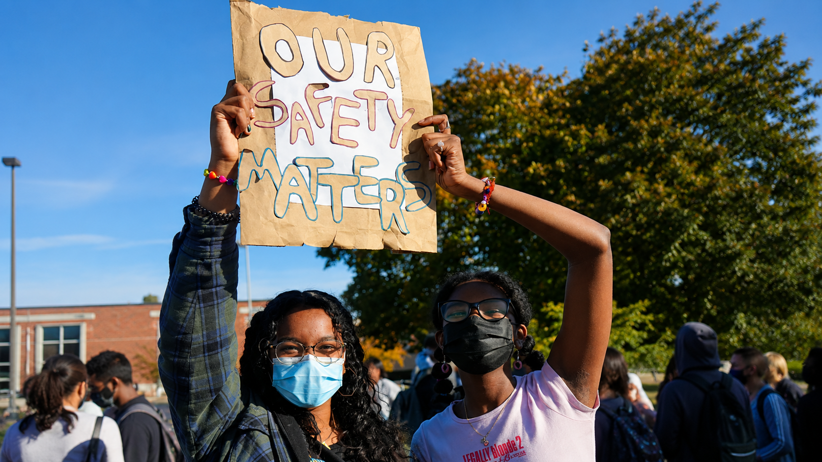
- Safety Vulnerabilities: Transporting heavy, pressurized cylinders on personal vehicles without safety protocols is dangerous.
- Opaque, Inconsistent Pricing: Gas prices fluctuate constantly, and delivery fees are often negotiated arbitrarily by local merchants.
- Operational Inefficiencies: Station attendants and delivery drivers have no centralized system to track orders, manage payments, or dispatch delivery jobs.
- Inefficiency in Scaling: Logistics costs and pricing vary heavily across different Local Government Areas (LGAs), requiring custom operational controls.
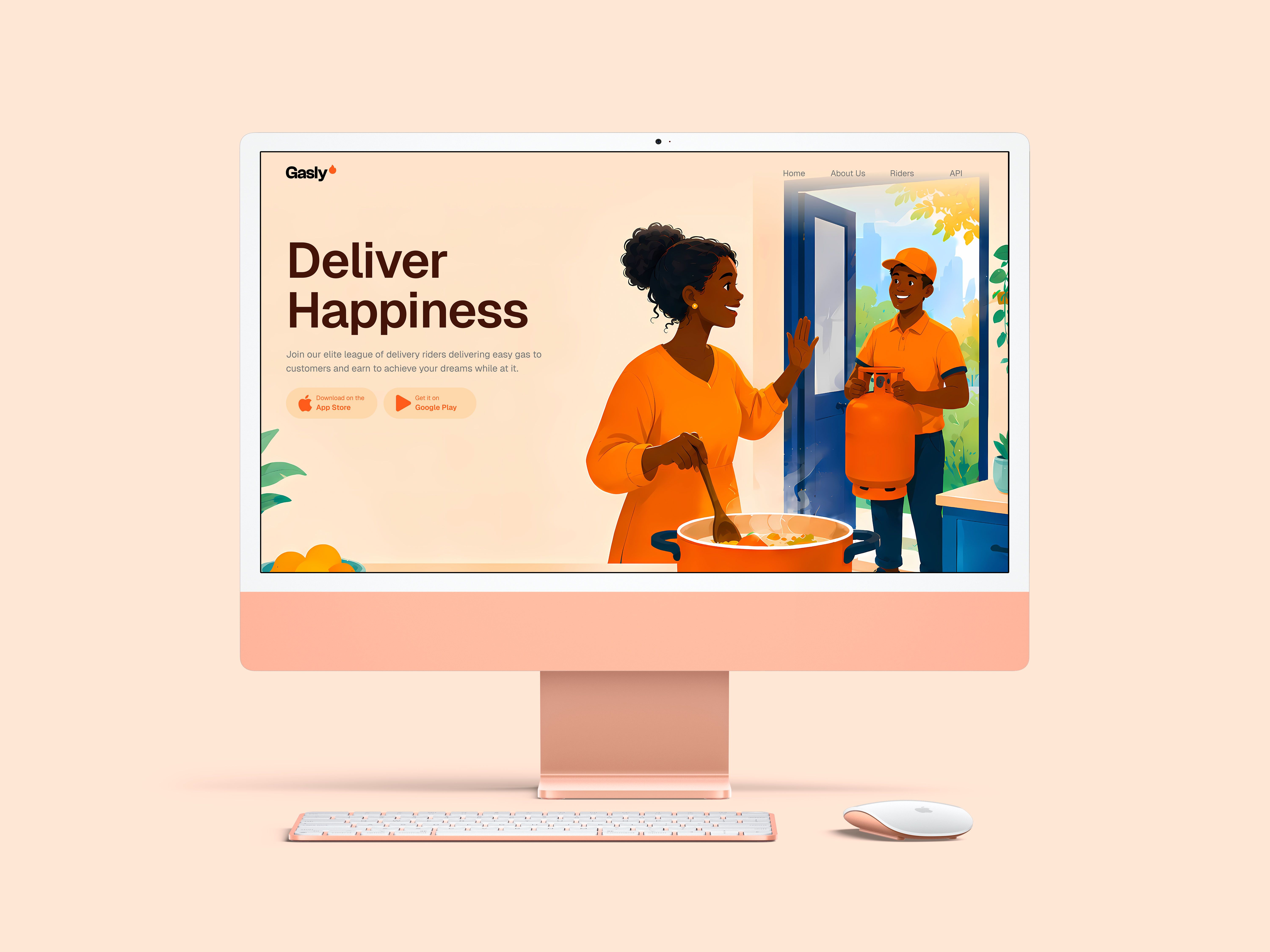
To ensure a seamless user experience, the interactions between the four touchpoints were mapped
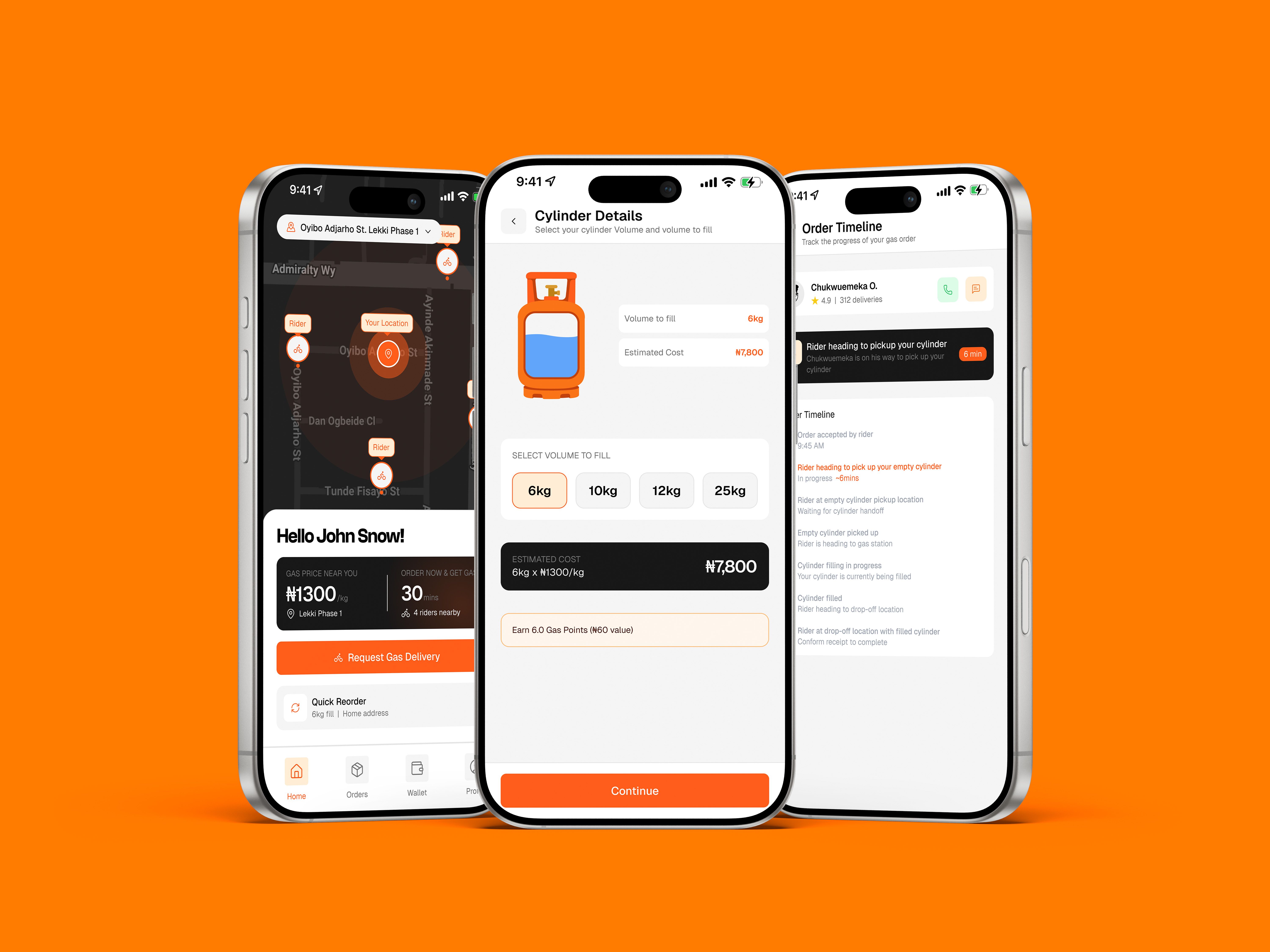
The customer app focuses on speed, trust, and ease of use. It is designed to feel as simple as ordering food.
1. Simple Cylinder Selection & Verification
- Cylinder Size Component: Standardizes selection with custom visuals for 6kg and 12kg cylinders.
- Volume to Fill: Allows users to choose a custom refill level (e.g., fill a 12kg cylinder with only 6kg of gas) to accommodate tight household budgets.
- The "Refer & Earn" Engine: A viral growth loop rewarding users with wallet credits for every successful customer referral.
2. Transparent Wallet & Checkout
- Wallet Balance: Quick funding via bank transfers (integrated with popular local banks like GT Bank).
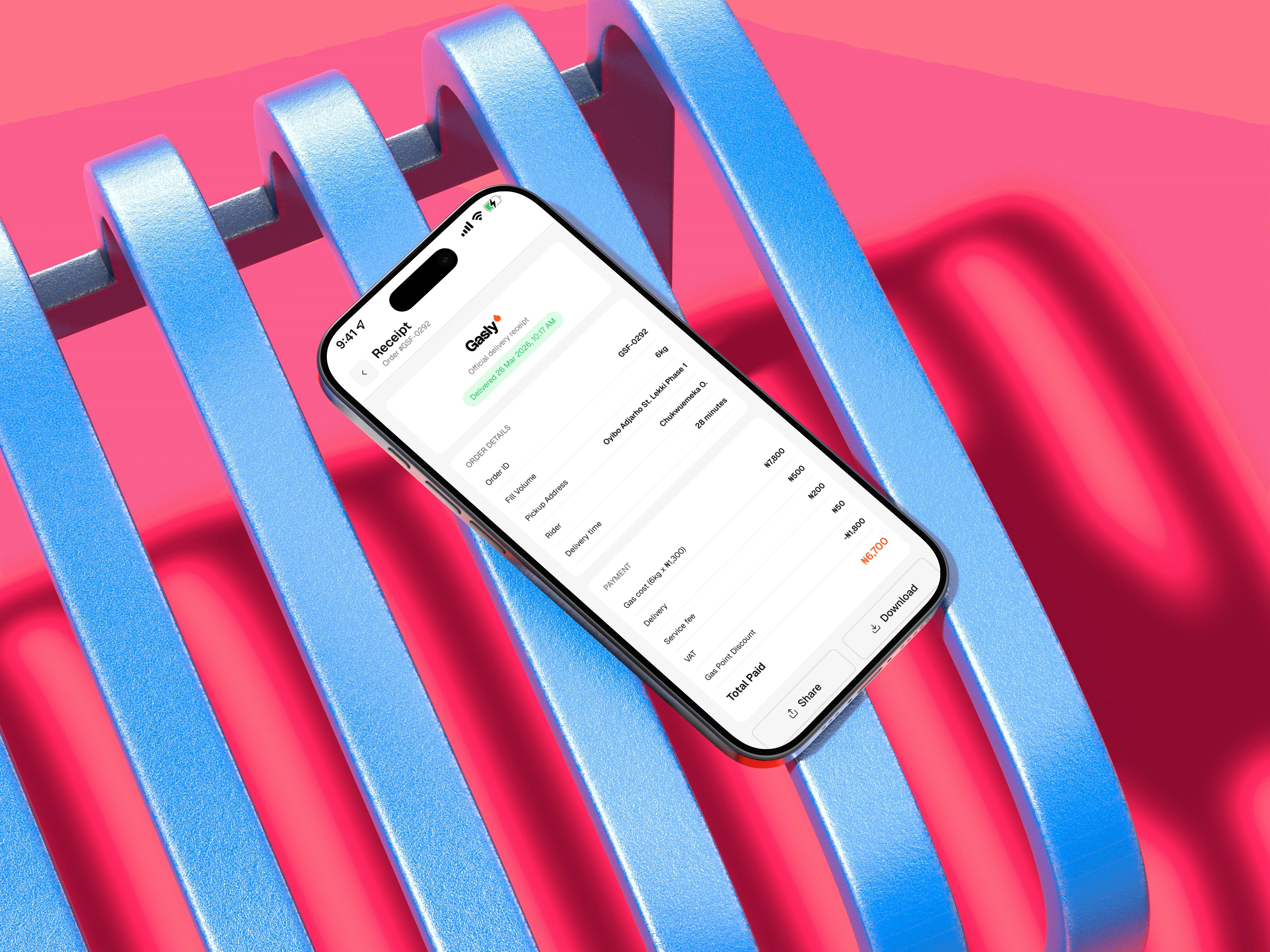
- Order Receipts: Standardized receipts displaying transaction codes (e.g., #GSF-0292), trip details, and payment statuses.
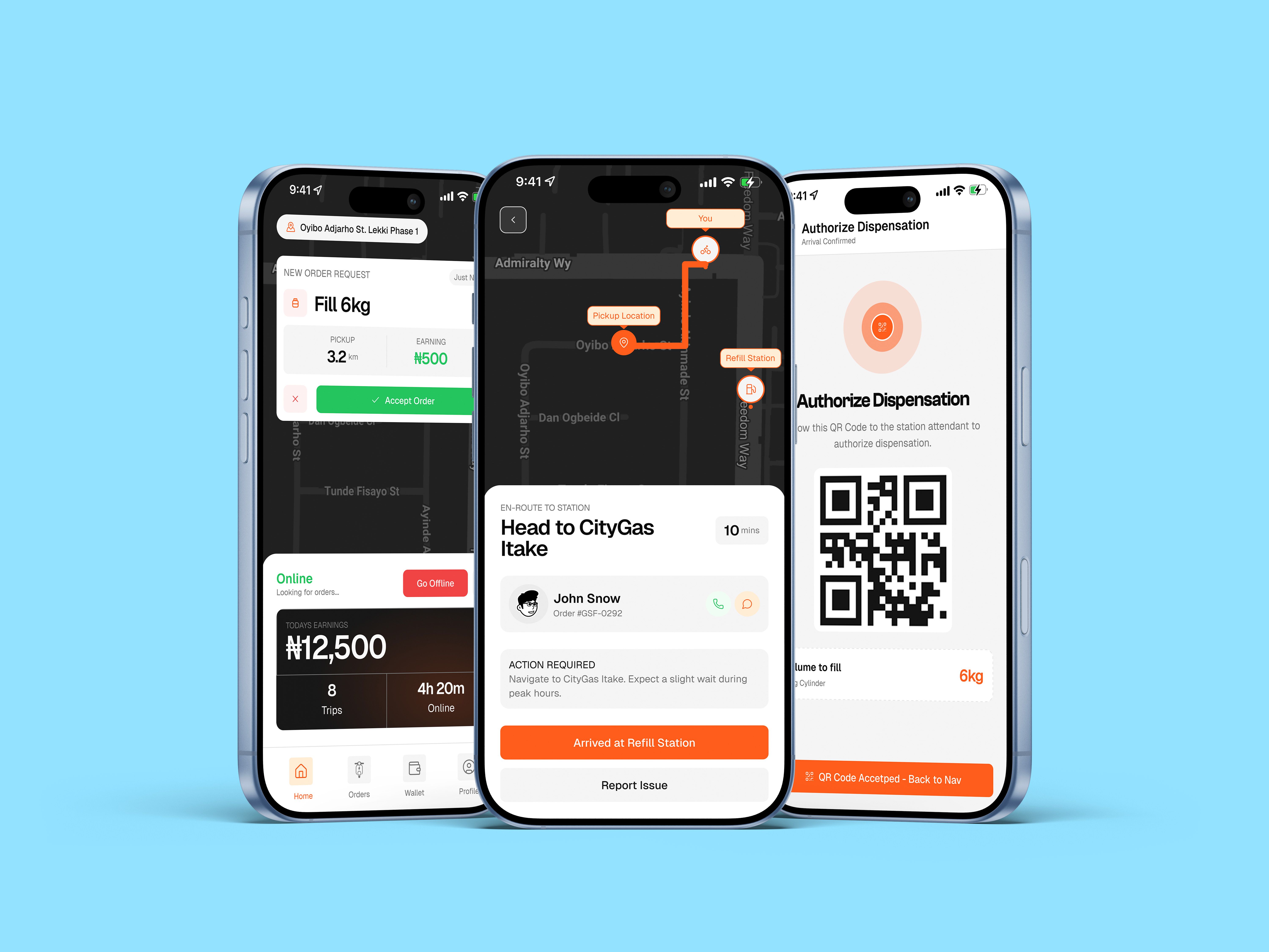
Riders are the backbone of the service. The design prioritizes clear earnings metrics, structured delivery steps, and compliance onboarding.
1. Compliance-First Onboarding
- Document Center: A dedicated screen where riders upload and track the status of their Driver's License, Vehicle Insurance, and LGA Permits.
- Safety Briefing: A mandatory, interactive onboarding step that teaches riders how to handle, inspect, and transport cylinders safely before they can receive orders.
2. Live Logistics & Dispatch
- Go Online/Offline Toggle: A simple home screen action to activate work status.
- Trip Breakdown Screen: Shows transparent earnings per delivery:
- Base Delivery Fare: ₦200
- Distance Fare (e.g., 3.2km): ₦300
- Total Earned: ₦500
- QR-Code Authorization: At the delivery location, the rider scans the customer's secure QR code to verify delivery, authorize the payment release, and eliminate rider-customer disputes.
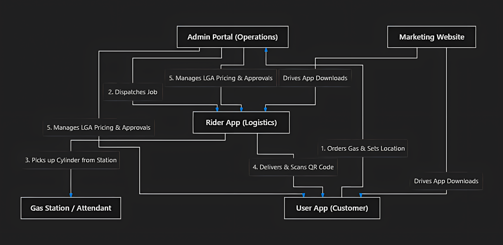
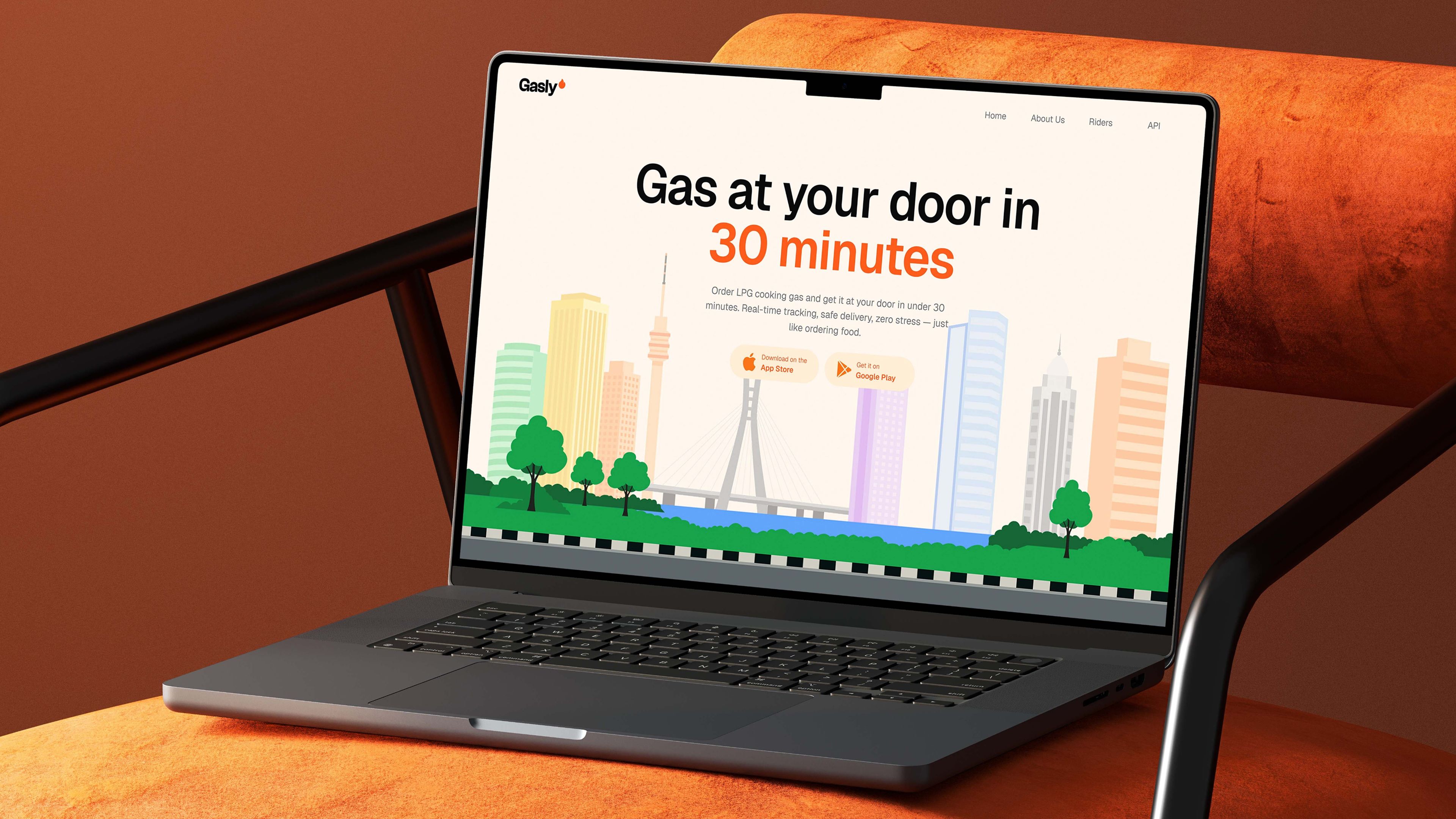
A clean, responsive desktop landing page designed to build trust, explain the 4-step process, and convert visitors into app users.
1. Clear Value Proposition
- Hero Copy: "Order LPG cooking gas and get it at your door in under 30 minutes. Real-time tracking, safe delivery, zero stress — just like ordering food."
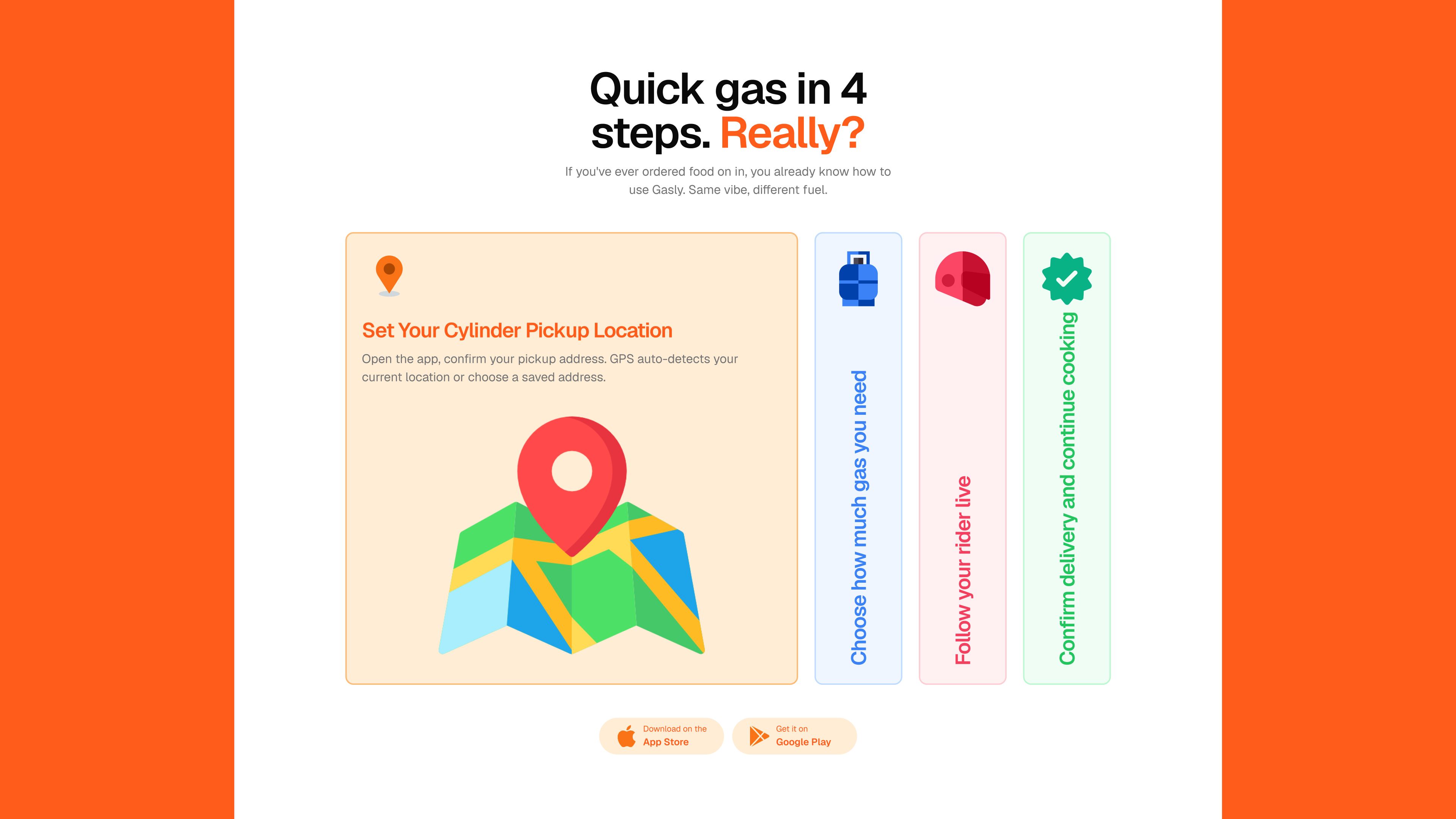
- Vibe Check Copy: "If you've ever ordered food, you already know how to use Gasly. Same vibe, different fuel."
2. The 4-Step Explanation Section
A step-by-step visual roadmap designed to address the customer's mental model:
- Set Your Cylinder Pickup Location: Dynamic pin drop on a clean vector map.
- Choose How Much Gas You Need: Cylinder weight and refill volume settings.
- Follow Your Rider Live: A visual representation of a delivery rider tracking on a map.
- Confirm Delivery and Continue Cooking: Interactive UI displaying the success screen.
The hero section features a Lottie animation simulating riders making gas deliveries. This Lottie animation was created in After Effects and exported to a .JSON format using the plugin "Body Movin". Then I converted it to Lottie so the file size can be greatly reduced while still keeping it's vector properties

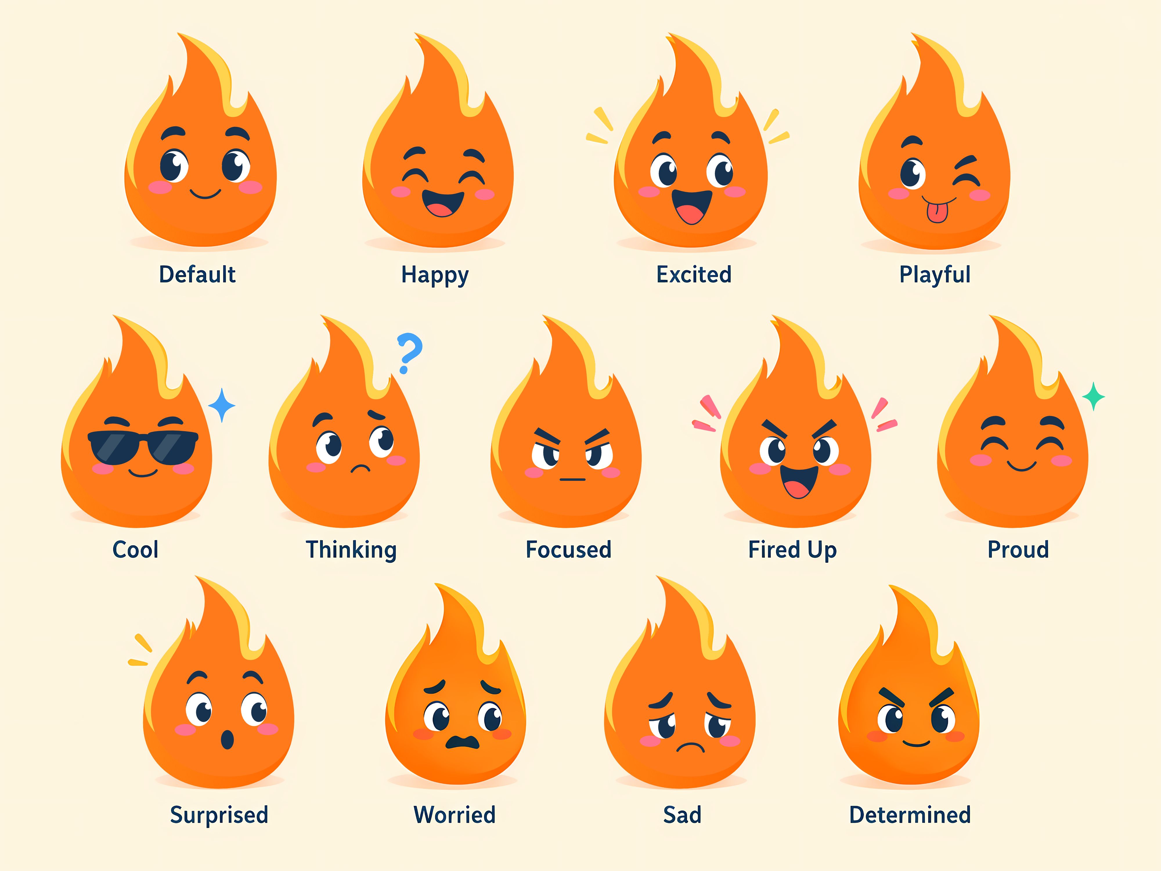
The project also required me to design a mascot for Gasly that could be used across it's branding to express emotions. Making the brand appear more cheerful